Work Samples
Here are some samples of my previous work, as well as a bit from the personal site redesign I’m working on.
Unfortunately, not all of my work can be shared — either because I don’t have access to the code, or because the sites are no longer available.
Still, I think this can give some idea of what I did in my previous roles!
ConnectiveDX Front End Work
At Connective DX, I worked on the front end team that did a complete site redesign for NW Natural, a Portland area utility company.
In that position, we worked using BEM and atomic design to build components in a React-based design system app, and then handed those components over to the backend team for them to build the site.
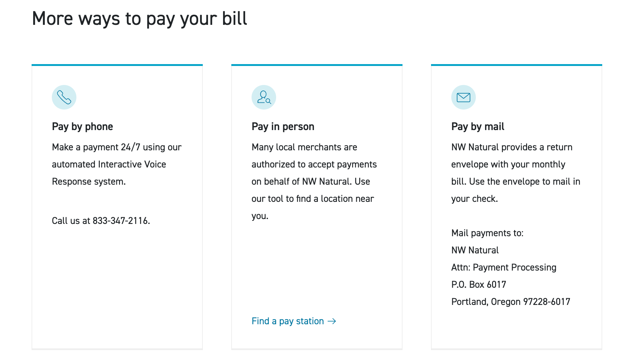
One example: I worked on the responsive cards on the Pay My Bill page, shown below.
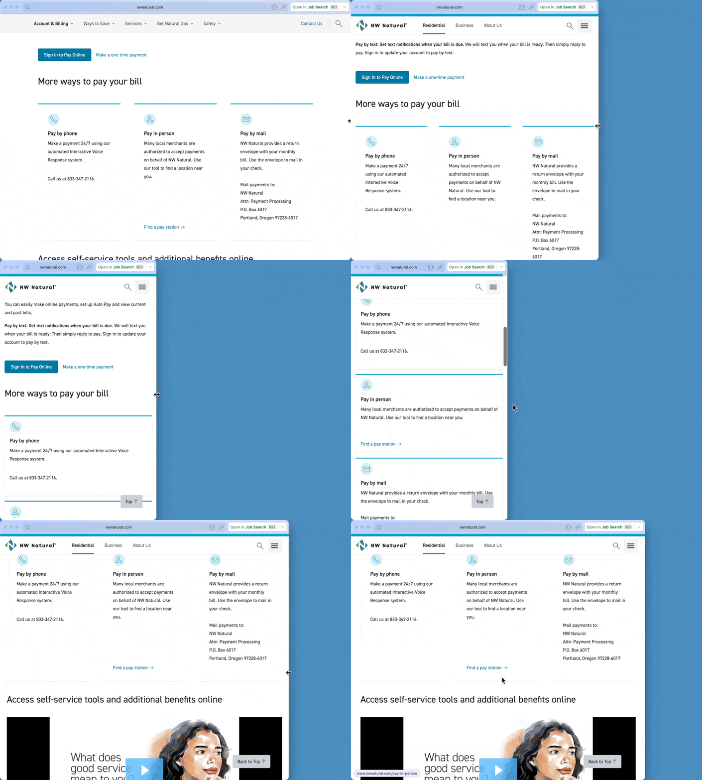
Here they are in action; I also helped with the little arrow animation at the end:
Most importantly, I came in when the site was in progress, and identified some accessibility issues (in particular, the colors needed to be adjusted, and they had some keyboard navigation issues). I helped them work through those, and that set me up to always help with accessibility on every team I’ve joined ever since!
OpenContext Front End and Documentation Work
In my most recent position at OpenContext, I served as the first employee an only front end developer.
We built on top of the [Backstage opensource project][], and my work revolved around adding new front end features and, especially, changing the look and feel of the app to feel more like ours and less like a Backstage reskin.
Here are a just few things I worked on!
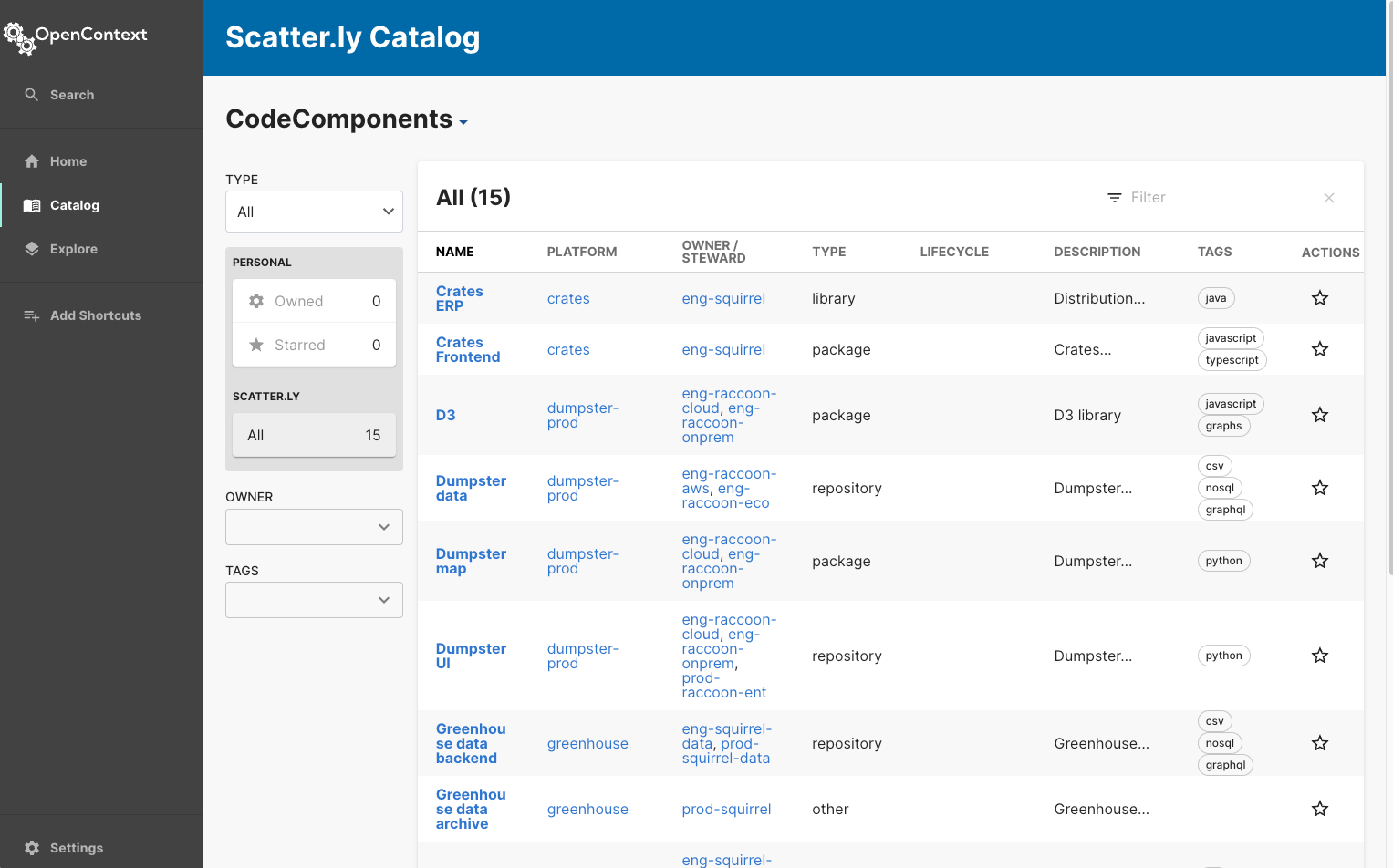
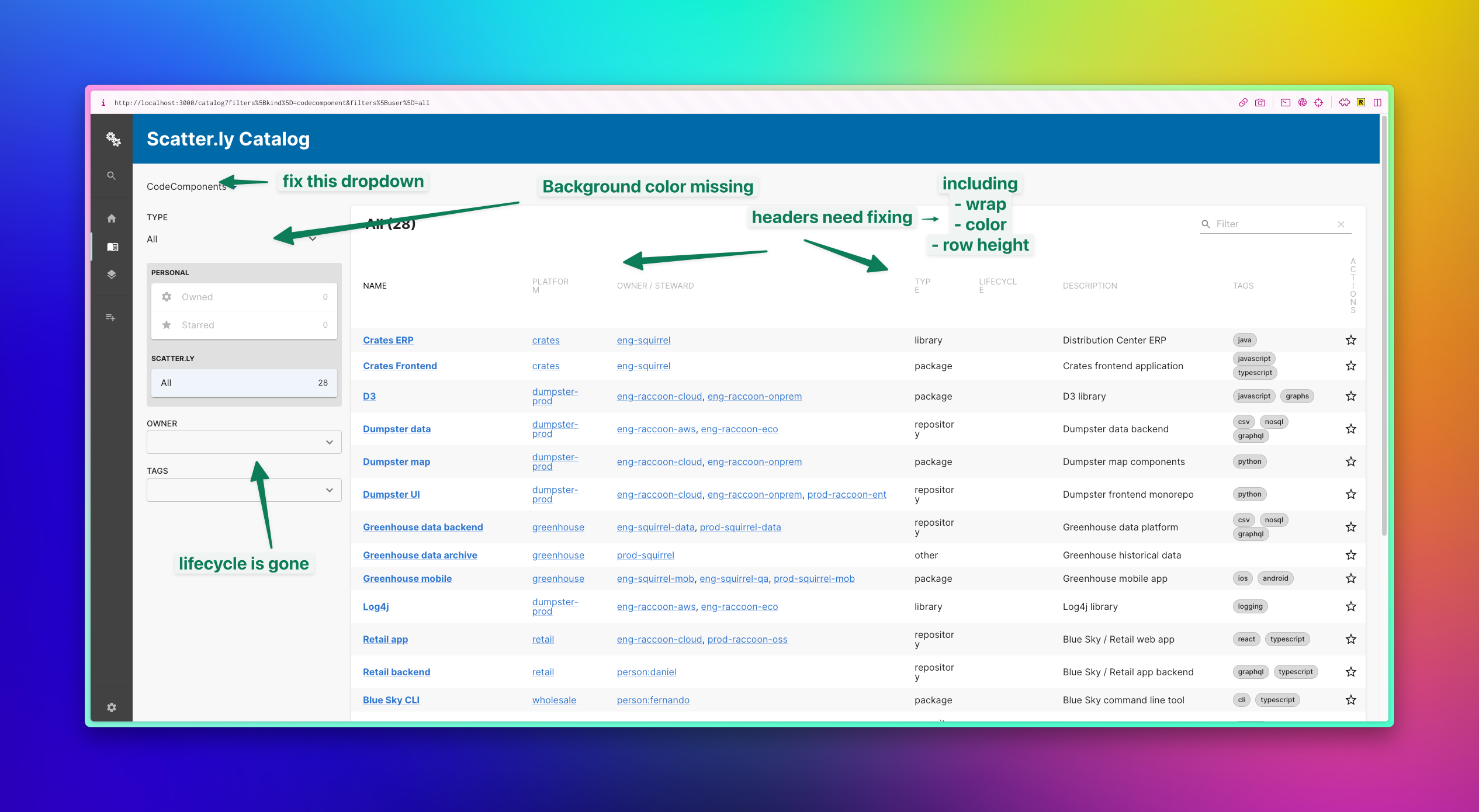
The image below shows a bit of work I did on the main page’s table. I helped product decide which information was most important to show first, and I also wanted to do that without a ton of horizontal scrolling. At some point we had to find a happy medium, and once we implemented MUI components for this table, we were able to get a good balance!
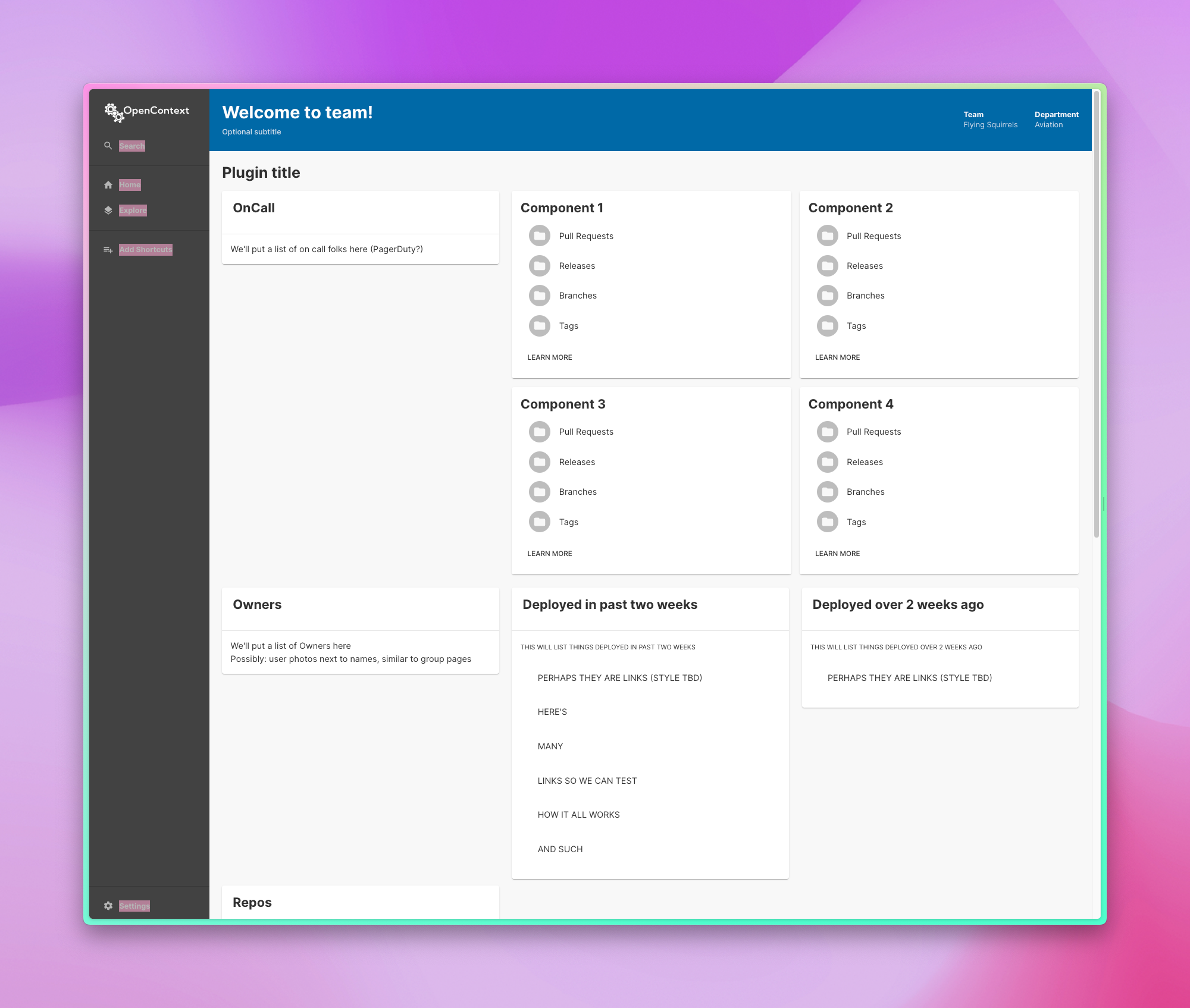
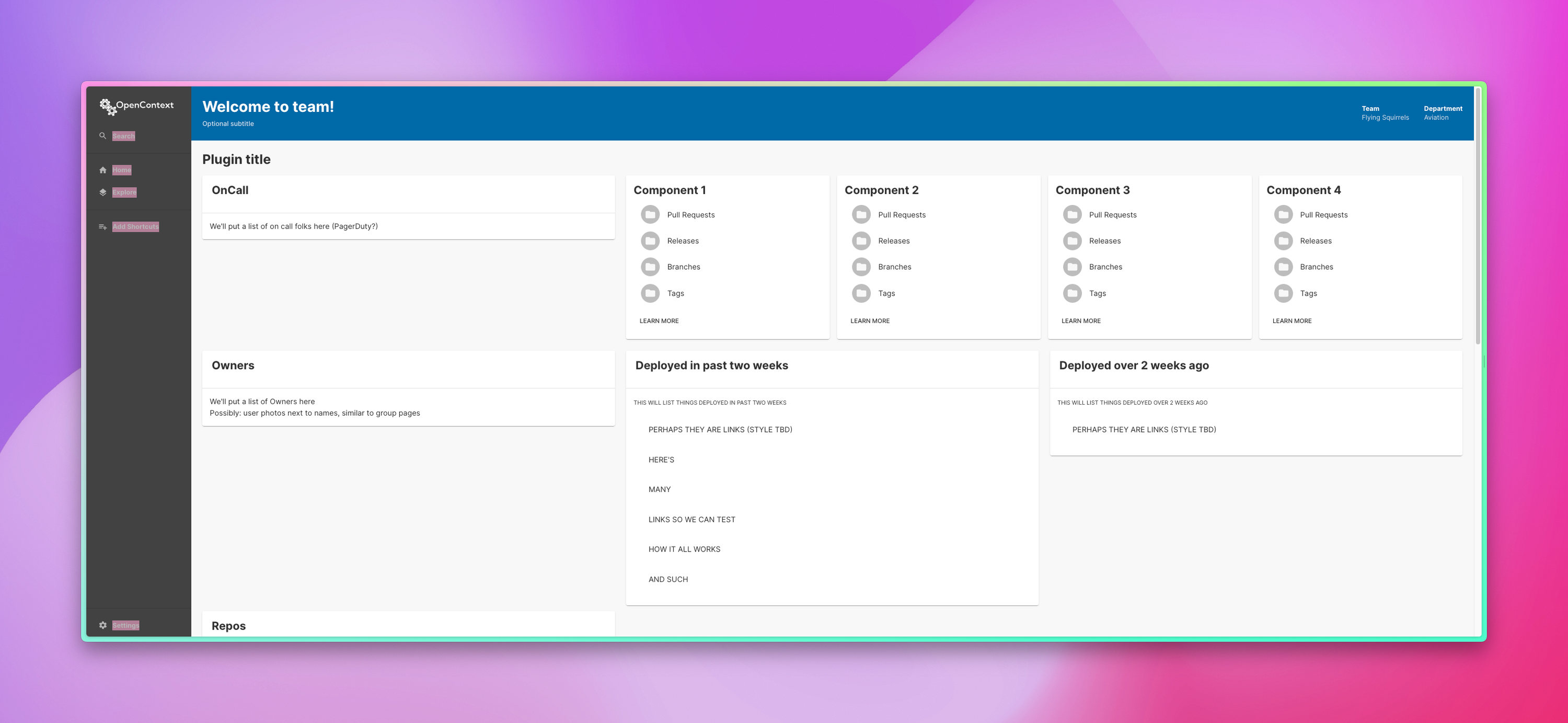
The next two images show an in progress team page we were working on, and how it was looking in both a regular view, and in widescreen.
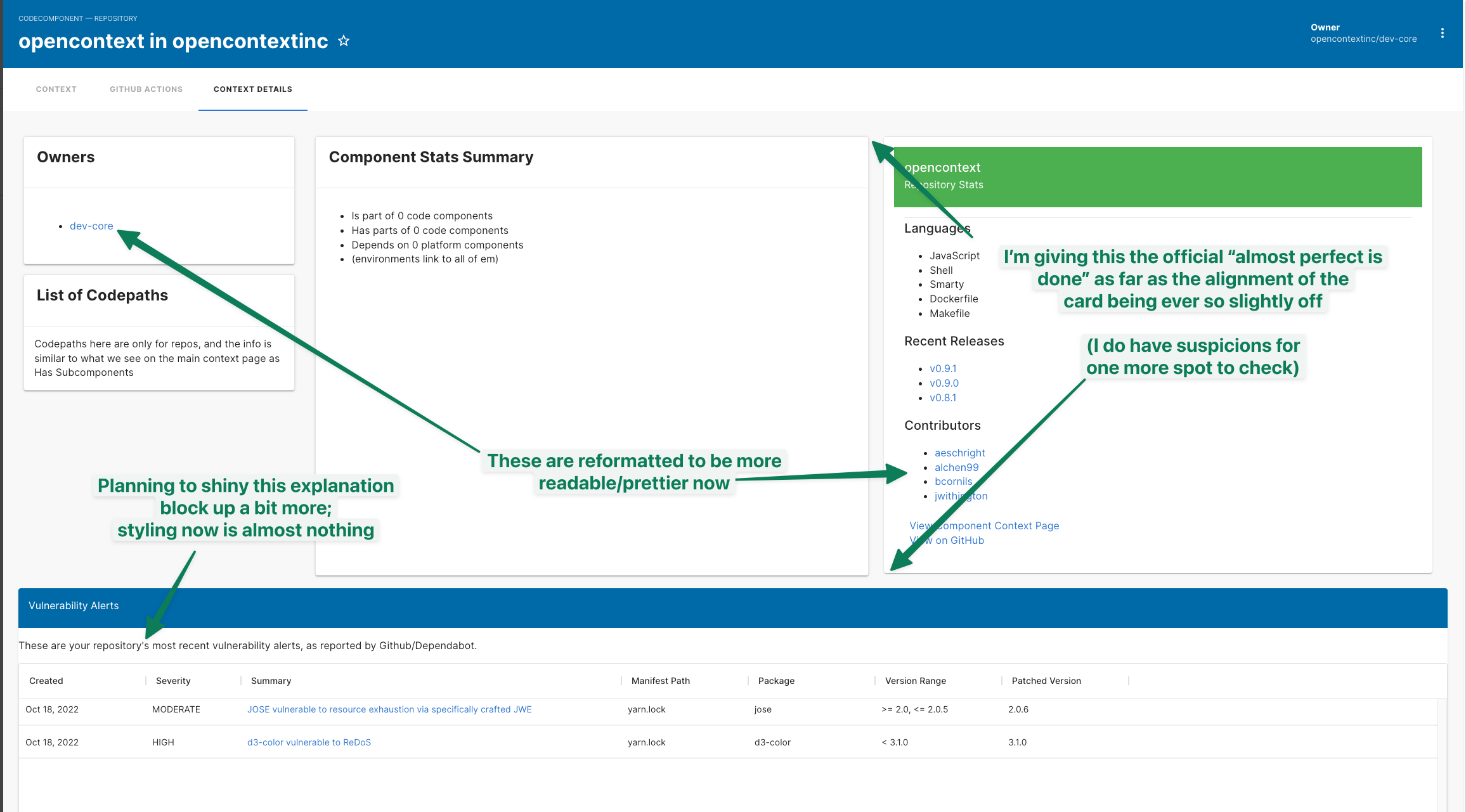
Since the entire team was remote, we often worked hard to be sure we documented what we were working on and progress we made. Sometimes we used these sorts of annotated screenshots as visual aids. This kind of thing can show how I work with a remote team. Here are two of my annotated shots — the first of shows an audit of issues I found, and the other is a progress update.
In addition, I edited / revamped a ton of our documentation. Here’s one example page that I did (hosted on my own site, so it looks a bit different than it did in production):
How to Navigate the Application
New Personal Site
I’m also currently revamping my personal site, using a combination of techniques I already had and things I’d hoped to learn! Eventually, this will replace what is currently at https://www.jimwithington.com/. The new things include:
- Tailwind CSS
- Building it in Eleventy
- Using different template languages like nunjucks, and
- Fully hosting it the Eleventy way on Netlify (a service I love but haven’t used too much yet)
Some of my ongoing progress pics are here, on the staging site for the new design:
Here are two blog posts related to the updates:
Accessibility Notes
Ignore it, then Deploy It
And here’s the related GitHub repo:
Evergreen State College Front End and Content Work
I also worked as half of the two-person web team at the Evergreen State College from 2020-2022. In that role, I helped finish the ongoing redesign and Drupal upgrade they were working on, while also training new site editors and doing a lot of the college’s COVID response (both pages and copy writing).
Unfortunately, that site has had another overhaul since I left. However, here are a couple of links I was able to grab from the Internet Archive that show some of the redesign I worked on:
https://web.archive.org/web/20210226221133/https://evergreen.edu/covid19/covid-19-information
https://web.archive.org/web/20220227233146/https://www.evergreen.edu/covid19