Accessiblity Notes
One thing that I believe in strongly: accessibility needs to be part of any project from the start, not just afterwards.
Today I ran some Deque axe tests on the day one stuff I posted the other day, and it turns out I already caught some issues:
- I made the
<h1>content for the site “Jim Withington,” but that header actually doesn’t describe what follows. This site will eventually be my portfolio/blog site, so even “Jim Withington’s Site” would be more appropriate. - I didn’t have a language attribute in the main html tag.
- My links are marked as
<h2>’s. I know better than that. A huuuge rule of accessibility: elements should not be used for presentation. To be honest, I think this resulted from me using a tutorial, and I also don’t think of this “design” as something I’m going to keep 😂 However, again, a11y from the start! - I never checked the color contrast the other day…and, obviously, even though I used placeholder colors, the grey and pink are not contrasting enough.(see below) So I’ll probably go back to using my fave
deeppinkuntil further notice as the background color. 😂

So today, those issues were the first things I worked on! Anything else could wait.
That said, once I did all that, I decided I wanted to quit having the full content of each post show up on the homepage. Even this early in the game, that bugged me. I’m working on adding a new variable called “teaser” where I can pull out a single line, add it to the front matter, and use that to represent the post. But it’s getting late and I have other stuff I want to do, so…tomorrow!
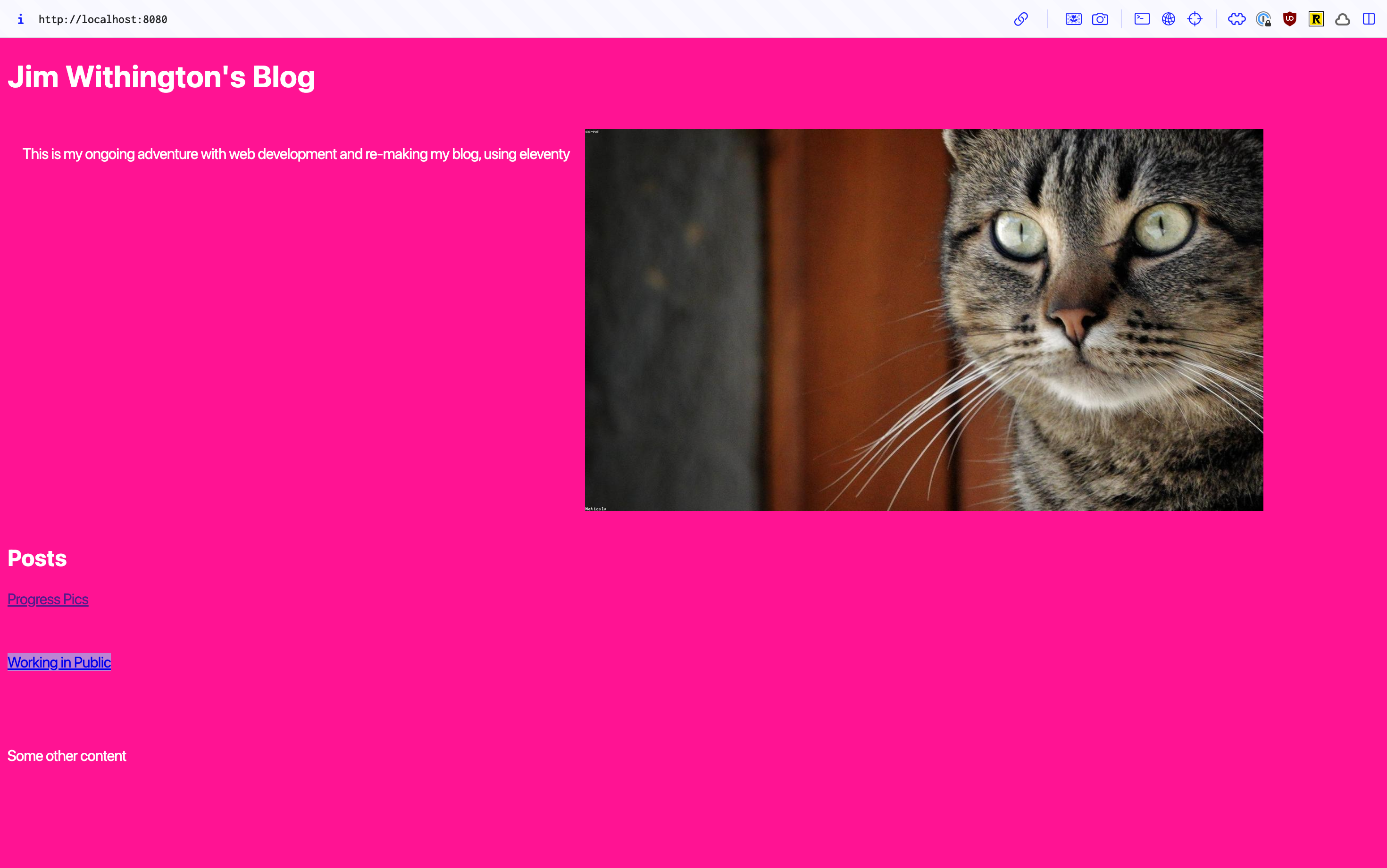
progress pic for today:
